
BindTuning web parts strive to provide a functional and collaborative platform, making sure all your users are able to contribute and maintain your Modern SharePoint infrastructure.
To do this, we've added a set of easy to access buttons that allow you to manage your web part entries.

However, those same buttons may not reflect your own brand identity and, subsequently, the defined color schema.
To do this, we've created a CSS snippet that will allow you to quickly tailor that same experience, making sure all elements of the page are in tune with your brand vision.
Before beginning
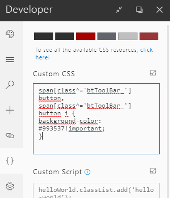
Make sure you replace the color provided in the snippet with the concrete color value you wish to have the buttons display as.
span[class^='btToolBar_'] button,
span[class^='btToolBar_'] button i {
    background-color: #993537!important;
}
Add custom CSS
To add the CSS rule above, you're able to make use of your themes' BindTuning Settings Panel:
- Open the site collection you wish to apply the CSS to;
- On the upper-left-corner of your site, select the option Bindtuning Settings;
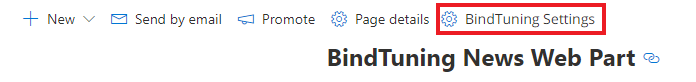
- Navigate to the Developer tab;
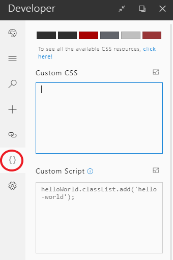
- Paste the modified CSS snippet on the Custom CSS box.
Final Result
After pasting the CSS, the modification will be immediately displayed.


Comments